Process: Creating a business logo
I enjoy branding, especially designing logos. It’s a process that requires various skills and some creativity.
I first started to document this process back in 2008 when I created a logo for Devoted Media, but never got around to publishing it.

I wanted to come up with a logo that was an instantly recognisable shape, but was unique enough to not be confused with anything else.
Of course the logo didn’t always look like this, it started with a pad and a pencil…
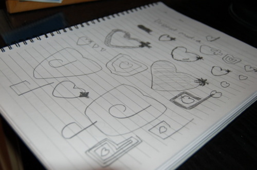
You can see the start of the logo I ended up with, with a few hearts in there which was meant to represent “devoted”.

More hearts, more curves…
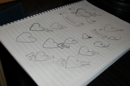
Hearts and arrows, banners and scrolls… Here’s a reject I attempted:

Back to the drawing board…

You can start to see elements like the two pronged “d” of the final logo taking shape.
Here was the first attempt:

It was too 80s, too square, bring on the curves!
Nice and curvy, but perhaps a little on the big side, let’s shrink that down a bit…
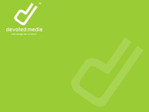
Perfect, big, bold, curvy and modern. Love it!

Here you can see the logo in it’s simplest form to show that it can be used in any form of media.
Comments