UX - Used Car Search
Searching for a used car is hard enough as it is.
As some light reading on a weekend trip to London I picked up a copy of the self described “weekly free motoring publication”, AutoExchange from a rack inside a supermarket.
Browsing the magazine, I found it very difficult to navigate through the various lists of used cars. Some are listed by type (4x4, Saloon, Hatchback, MPV, Estate, etc), while others are listed by make (Ford, Peugeot), while others were listed by price (often, high to low).
Like user experience expert, Theresa Neil, I had come to the same conclusion.
“I was shocked to realize how dependent I’ve grown on three simple features that just aren’t available in the analog world: search, sort and filter.”
I shared in this frustration of print and decided to go online when I got back to work to see the clever and intuitive ways the top “used car” websites tackle searching, sorting and filtering.
Analysis: Examples of existing solutions
These are “big names” in the motor industry, huge websites fighting for the “used car” top spot on search engines.
AutoTrader.co.uk

If you’ve ever searched for a used car, you’ll be more than familiar with the form that sits on the left hand side of this website’s homepage.
You’ll see a place to put your postcode, so they sort by nearest car, you’ll see drop down boxes for make and model, and minimum and maximum price brackets, with more options available.
Motors.co.uk
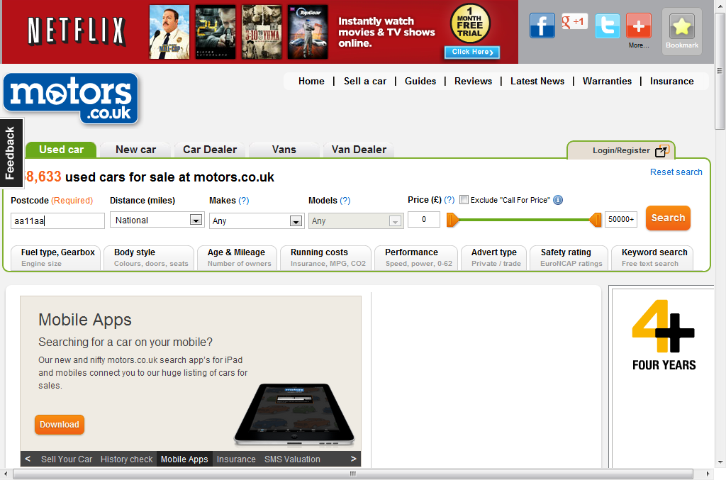
On this website, you’ll notice how their search bar is above the top of the content and remains there when you do a search. Their search also features a required postcode, make & model dropdowns, and a price bracket.
Exchange and Mart.co.uk
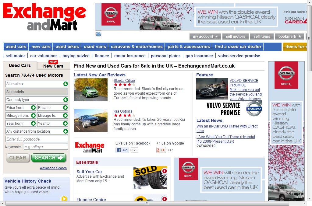
Again, the search appears on the left, make and model, price bracket and postcode. It also features mileage, year, distance and allows you to enter some free form keywords.
The elephant in the room is that in all of these selecting the make and model is counter intuitive, in the sense that, you’re unable to select the model unless you know or select the make first.
CarWoo.com
I decided to take a look at the website of a company that describes itself as “changing the face of the auto industry” after hearing so much about it on the popular social news website, Hacker News (a website about computer hacking and startup companies, run by Paul Graham’s funding firm Y Combinator).
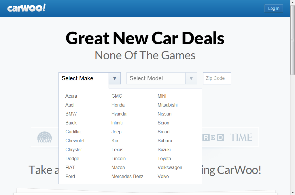
I was pretty shocked to see that even CarWoo had fallen into the same trap with these counter intuitive drop down menus that seem to plague the industry.
Interestingly, I’m not alone with this, Jason Shah, who periodically advises early stage startups on product, design and UX, after having his own success, seems to agree:
“The dropdowns, where the 2nd (the Model) is conditional on the 1st (the Make) is elegant. It’s nice. But what I really want is to just start typing in what I want. “A…c…u…r..a…T..L” or “T…o…y…o…t..a…C…a..m..r…y”. With auto complete, typing this in would be way faster. I don’t want to have to scan the list, move my mouse around, and figure out how slick of a system you have. In the end, I really like your slick looking dropdowns. But do I think it will convert as well as a single autocomplete text input? No.”
*http://blog.jasonshah.org/post/16984372914/3-ux-ideas-to-help-carwo*o
Sure, the drop downs on CarWoo are pretty, but autocomplete is better, right?
Design: Patterns and trends
I decided to go back to the drawing board by taking a look at what solutions were already in the wild. My first port of call was to take a look at the jQuery Mobile framework as I had already seen the demos contained many references to the motor industry (ie: lists of car manufacturers).
I got in touch with jQuery Board member and all round fun web guy, Paul Irish asking him if he had any insight on best practices on searching for used cars. He didn’t, but he did have some suggestions on where to find design patterns.
PatternTap.com
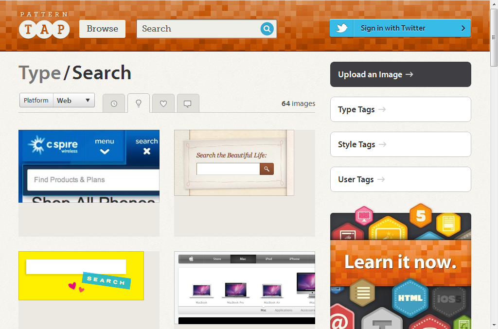
http://patterntap.com/tags/type/search
Pretty uninspiring results with regards to search (although I do like the new *patterntap *website itself).
ecommr.com
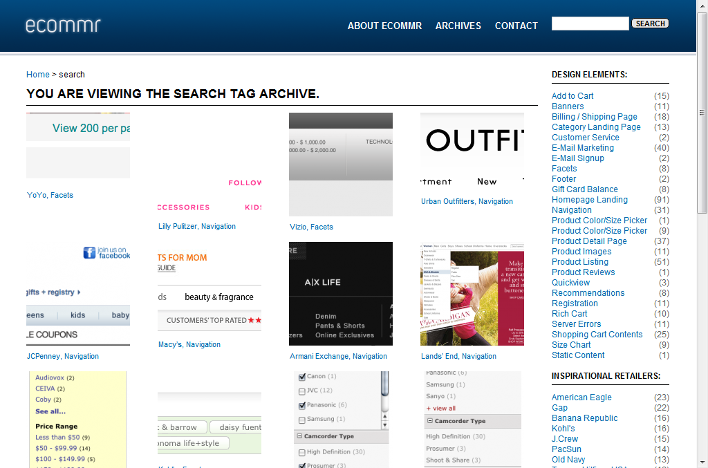
http://www.ecommr.com/tag/search/
Surprisingly, *ecommr *doesn’t have “search” as a design element, but does have a tag. Still pretty uninspiring.
Vimeo.com (UI Patterns group)
The videos did give some hints of search, but nothing that stood out, only autocomplete combo boxes…
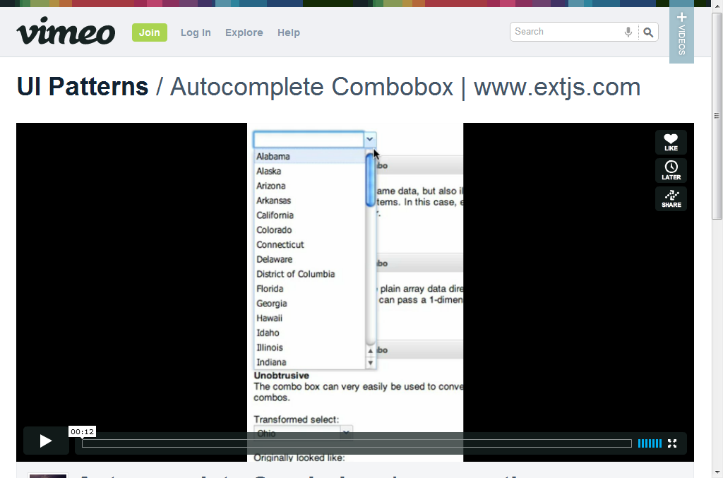
| Autocomplete Combobox | www.extjs.com (http://vimeo.com/groups/2071/videos/1441214) |
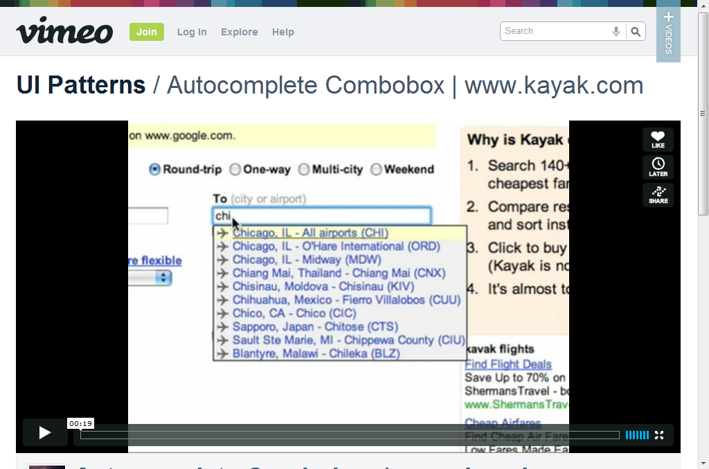
| Autocomplete Combobox | www.kayak.com (http://vimeo.com/groups/2071/videos/1441235) |
UI-Patterns.com
I also came across ui-patterns.com which had a dedicated search section which also seemed to be packed with autocomplete combo boxes for searching from a list of pre-defined choices.
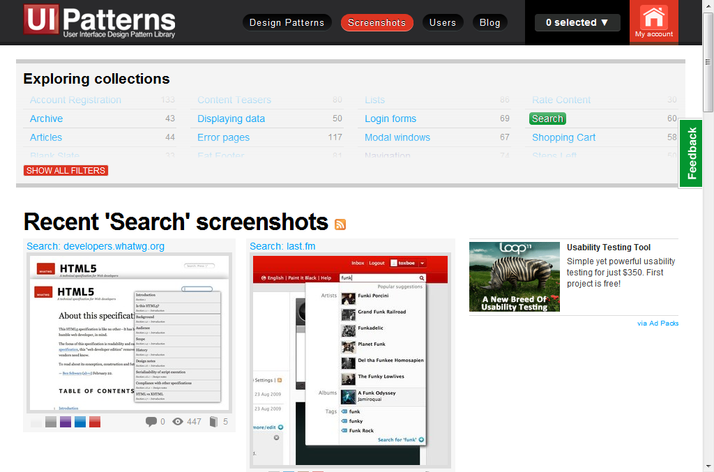
http://ui-patterns.com/explore/collections/search/
As you may be able to see from the image, the first two screenshots on this page provide great examples of autocomplete combo boxes.
Last.fm
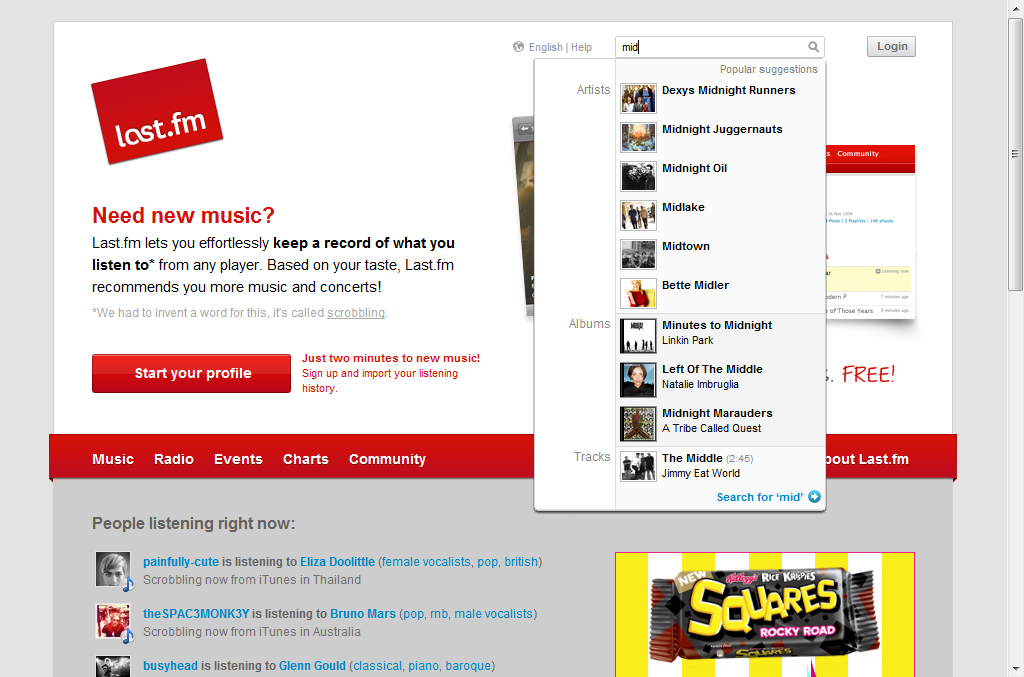
I especially liked the last.fm search box as it provides a little image next to the result. A nice touch if you’re going to be searching for cars.
Design Development: Is auto-complete the right solution?
I like the autocomplete combobox approach, however, I couldn’t help but wondered why nobody else gone for this…
Armed with the industry examples, these patterns and Theresa Neil’s article on UI Patterns For Mobile Apps: Search, Sort And Filter, I began to draw some conclusions.
There were many options for search and most of the motor industry websites are using the counter intuitive drop down menus selecting the make and model you want to search for.
I decided to think outside the box and take prompt from arguably the biggest second hand market in the world: Real Estate.
I searched on Google UK for “property” and checked out the top 3 sites to see how the top real estate websites do search…
RightMove.co.uk
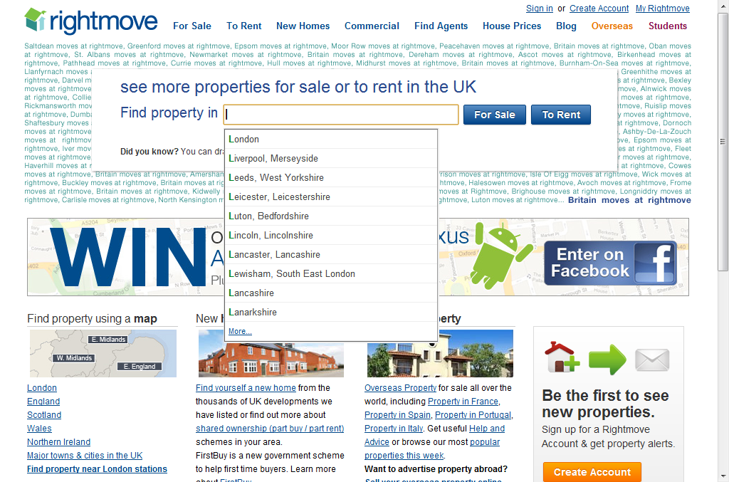
Their website has a neat auto-complete which will list the city or county ready for searching.
FindaProperty.com
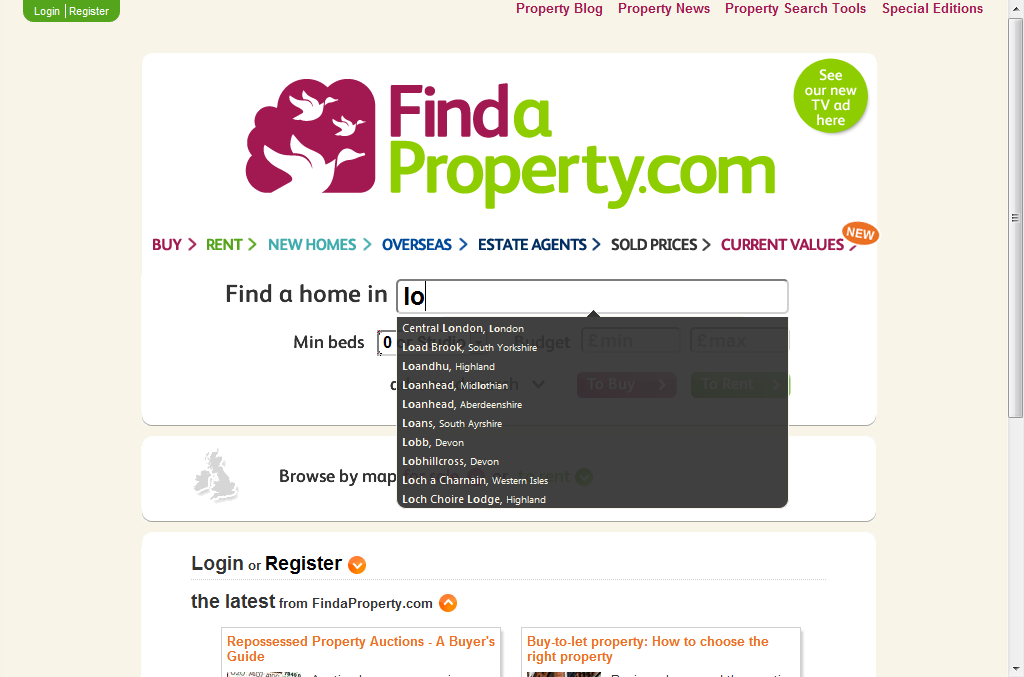
Again, this site sports a neat auto-complete which will list the city (but oddly not county) for searching.
Zoopla.co.uk
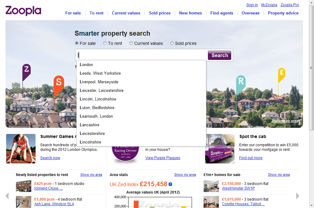
Yet again, another example of a neat auto-complete which will list for the city or county for searching.
This kind of autocomplete combobox is perfect for a partial match based on the make and/or model of car the user enters into the search field.
Development: Finding the right solution
As I said earlier, my first port of call was the jQuery Mobile framework as I am keen to take the “mobile first” approach to developing a used car search.
As I discovered, jQuery Mobile doesn’t have a native “autocomplete combobox” implementation.
However, what jQuery Mobile lacks in its youth, its mature sister project, jQuery UI makes up for by offering a native demonstration of an autocomplete combobox.
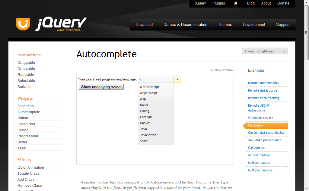
http://jqueryui.com/demos/autocomplete/#combobox
Very nice. It works as expected and everything!
I decided to head back to last.fm where I’d see the really cool autocomplete combobox to check which framework they used, only to discover they were using scriptalicious instead, while I’d prefer to stick with jQuery.
Just by chance an email from hotscripts.com dropped into my inbox, which pointed to an article on their site entitled “40+ jQuery Plugins to Spice Up your Website” (http://www.hotscripts.com/blog/jquery-plugins/). Interesting I thought…
Low and behold under the “jQuery Form Plugins” section I found what I was looking for:
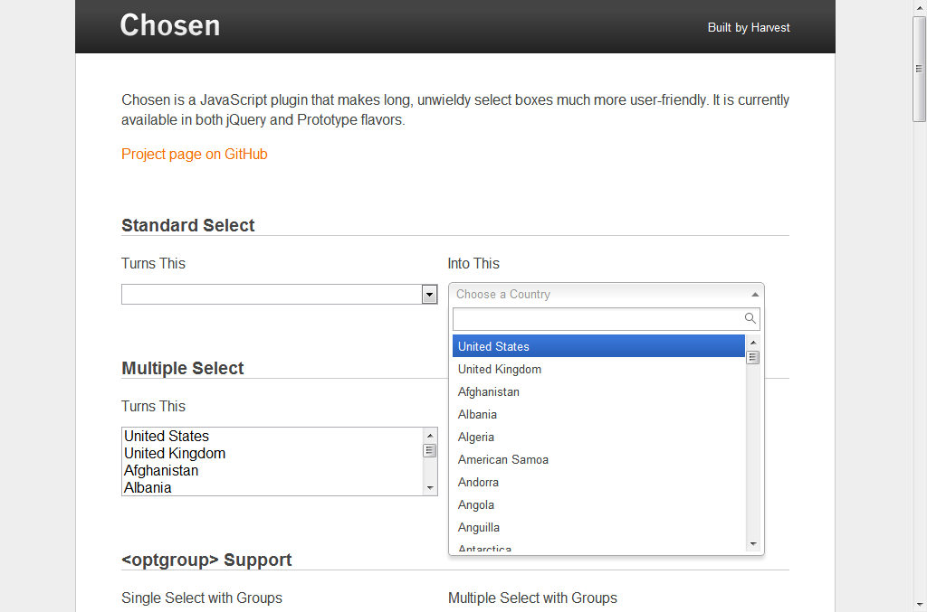
http://harvesthq.github.com/chosen/
To re-enforce how good Chosen is, I discovered that the all new “gov.uk” beta website uses it, be it in their admin backend, rather than anywhere publicly accessable, as I later discovered, but a great accreditation all the same.
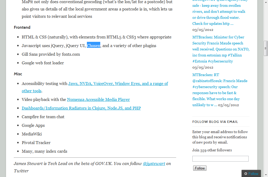
http://digital.cabinetoffice.gov.uk/colophon-beta/
Perfect!
Development: A demo
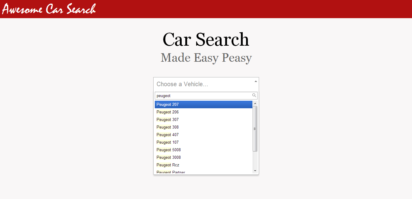
Using some sample data I collected some time ago I was able to generate a basic HTML options list and mould Chosen around it to create a working example of how it might look in production.
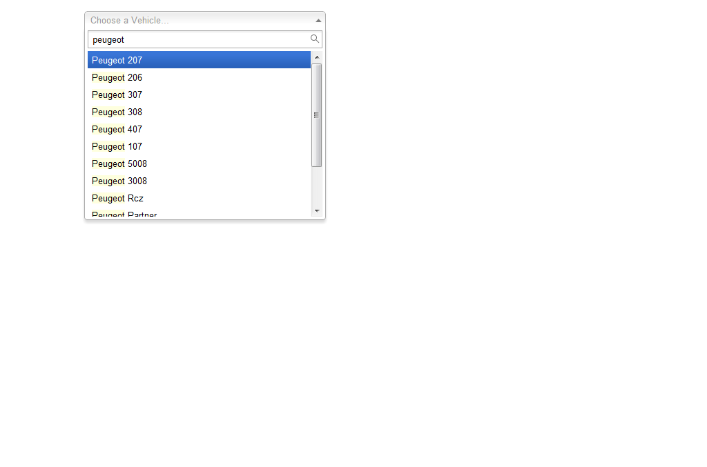
This old list doesn’t include the new Peugeot 208, but as the database is populated by the data feeds it will be updated.
The list aside, everything went as expected.
Development: A (possible) problem
After spending some time doing this I very quickly came to realise why large used car search sites don’t do this.
Essentially if you create a HTML select option for each and every car that exists you end up with a HUGE chunk of HTML that takes a long time to load each time you load the page.
Their solution is to give you a choice from a shorter select menu of just manufacturers which loads a secondary select menu of cars available from that manufacturer.
However, there is another perfectly good solution that will work for most which is to simply load only the makes and models for the cars you have in stock. If you’re a medium sized dealership group you’ll only have a select amount of cars anyway.
Then I discovered select2.
Development: The right solution is here
Select2 is described as a jQuery based replacement for select boxes which supports searching, remote data sets, and infinite scrolling of results. The look and feel of Select2 is based on the excellent Chosen library.
The major difference between the Select2 and Chosen libraries is that Select2 handles remote data sets and offers infinite scrolling.
What this means for developers is that you don’t need to wait for a huge chunk of HTML select options to load, you just load the list in small chunks as you need it using a remote javascript calls to a script (AJAX).
This is the right solution.
Development: A demo, take two
The demo I’m going to go with will be a combined approach of a drop down select list but with the ability to remote load the data on demand to avoid the page taking too long to load.
Comments