Upgrade: Randles Used Cars
I’ve now finished rolling out “Phase 2” for the Randles website.
- See the updates LIVE at www.randles.co.uk
To start with there were three database issues I wanted to address…
Firstly, The type of database we were using is no longer suitable. The used car database was powered by a simple SQLite implementation. SQLite is fine for lightweight tasks, but will not scale as much as say MySQL. This was migrated to MySQL.
Secondly, management of the vehicles needed to be improved. In order to scale the usability of the “used car” section, it demands a user interface. You should be able to easily add/remove from the database. Using MySQL provides the basis to allow this to happen.
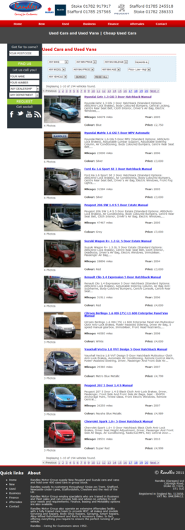
Thirdly, the previous URLs for used cars was terrible (eg: http://www.randles.co.uk/used-view?id=17714916-hpidow0443304). This needed to be transformed into much prettier and SEO friendly URLs (eg: http:// www.randles.co.uk/used/view/1/peugeot-107). Once the database was running on MySQL and it was easier to manage old and new entries and is easier to utilise and maintain the entry IDs.
This was a blocker. Until this was carried out it would make expanding on this section much more difficult and although there was no visual different (apart from the URLs) it was a task that needed doing.
I decided to stick with the PHP PDO database abstract layer and simple adapt my code to handle both MySQL queries and SQLite queries.
I used sqlite2mysql.php to migrate the actual database, then just flicked a switch to start using MySQL instead of SQLite. Almost seamlessly.
I updated all the import scripts and implemented adminer (Database management in single PHP file) for any adhoc edits via the existing interface.
All went well on the development site and so I pushed it to the live site.
So what’s next?
The “used” section is probably the most important page on the website after the home page.
We’re used to seeing the same old “autotrader” approach, we can do better! Let’s go back to basics…
There’s 3 simple features that aren’t found in print that the user expects on a used car website:
- Search
- Sort
- Filter
It’s important to remember how important these functions are to the user and build an experience that is centered around them.
The style, design and general presentation was much to be desired, this needed to be updated with these new features and brought into line with the new styles.
In addition to this, modern features have been introduced:
- Autocomplete combobox – this will replace the traditional make & model dropdowns
- Remove pagiation – infinite scroll and/or “more results, button”, similar to Google Images
- Price slider – prettier user interface for the end user
Here’s the result:
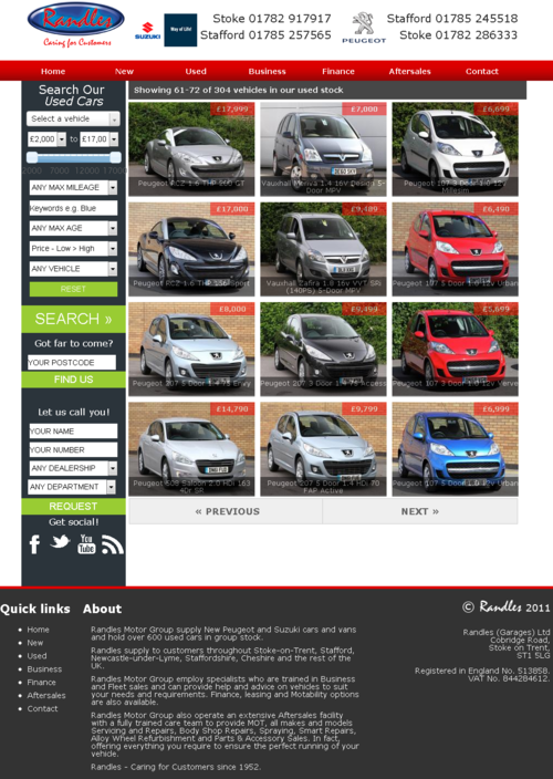
Here’s what you’re looking at:
- **Header: A smaller header/banner section giving more focus to the content.**
- Search: Removed from the body content, onto the left hand sidebar, styled in-line with the home page.
- Auto complete combo box: Simply click the drop down and either choose or search for the name of the car you’re looking for, even if you don’t know the make. Couldn’t be simpler.
- Price slider: A really simple visual aid.
- Pagination: Having so many pages to choose was intimidating for visitors. The “Next” and “Previous” buttons combined with search, filter and sort functions means there’s no need for traditional page numbers.
- Photos: Pictures are faster than words, so the jargon was removed and replaced with photos of the vehicles with the price and a caption.
- Labels: I used a semi-transparent block on top of the photo to clearly display an informative caption underneath, while still letting the photo “shine through”.
Combined with an updated style, I’m sure you’ll agree that it’s a much more inviting page.
As if that wasn’t enough, the individual vehicle profile pages or “view” pages were begging for a refresh too…
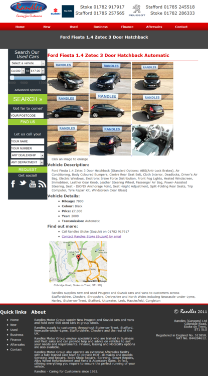
What I needed to improve:
- The second heading (h2) is surplus to requirement as the title is already in the grey title bar.
- The price should be clearer.
- The images (often sets of 3 or 9, sometimes more) take up a lot of space and are rather intrusive. Replace this with one large image and a smaller set of thumbnails, which should all fit inside about 50-60% of the content area.
- The vehicle description doesn’t need to be labelled as such, it should be obvious.
- The “Standard Options” or features should be managed into an easy to read table or grid with supporting images.
- The vehicle’s details can be laid out with the description to make it more appealing.
- The location details and map should be better presented so it seems more integrated. The map should be clickable.
Here’s the result:
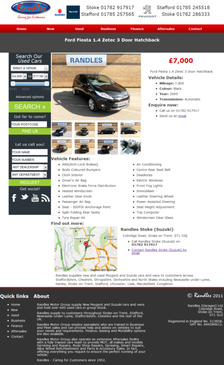
Sure, we’ve still got work to do here, but with a few tweaks here and there, we’re on the right path to “Phase 3”.
Comments