Makeover: G. S. Unwin Bodycentre Ltd.
- G. S. Unwin Bodycentre Ltd. website gets a facelift.
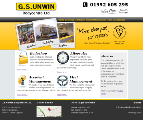
Glen Unwin got in touch with me to discuss a revamp of their website that was first put together back in 2005. This modern era has shown that websites are more than just information about your business they are a marketing tool and should be used that way.

- The header really needed to stand out. I stuck with the original colour scheme to create a banner. The kitemark is really important to Glen and needed to be prominent on the site so this was the perfect place.
- The images in the header are crucial to show the size of the operation, giving visitors a more informed idea of the business they are dealing with.
- The pitch ”more than just car repair” makes it easy for visitors to quickly understand what the business is about, making it obvious that not only is the business about car repairs, but other services are on offer too. This is how it was briefed to me by Glen and as such I included his name below the statement to add authenticity.
- Call to action, as part of the “About us” in the sidebar, visitors are encouraged to get in touch if they want to know more.
- The footer was the perfect place to put all the contact and copyright information, as well as a little map linked to Google Maps to get directions.
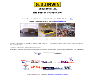
I’m sure you’ll agree that the new site is a tremendous improvement on the original (be it only a simple place holder).
You can visit the new G. S. Unwin Bodycentre Ltd. website at: www.gsunwin.co.uk.
Enjoy!

Comments