Makeover: The IT Exchange Ltd.
- The IT Exchange Ltd. website gets a facelift!
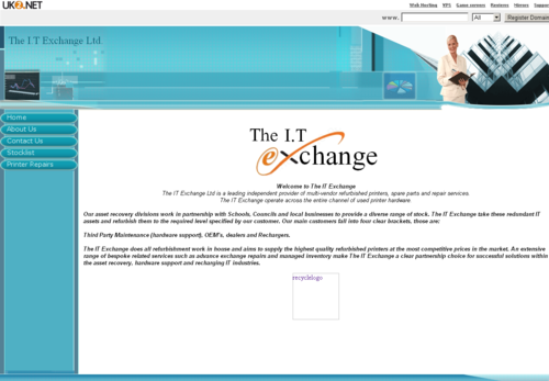
When I first met Simon from The IT Exchange Ltd (ITE), he explained to me how his website was outdated and wondered if I could do him a new one.
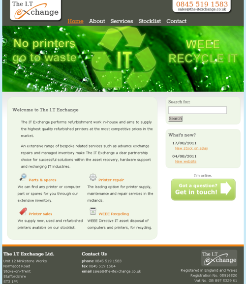
ITE are printer specialists and really wanted to stress how they recycle IT and that no printers go to waste.

Tired: Their original website
Fresh: Introducing the new website…

- The header shows a re-rendered version of the original ITE logo to retain consistency with their stationery. The contact telephone number is clearly displayed on the right along with the email address to make it easy for visitors to get in touch.
- The banner really had to show what ITE is all about: printers and recycling. Being green is important to businesses and they wanted to show that they understand that.
- Smooth corners were a bit of a pain to implement on every browser, but worth it for that soft look and feel making it easy on the eyes.
- Call to action was added in the form of a large button so users can easily “get in touch”. A neat trick with this button is it’s also offers live help via Google Talk when Simon is logged in. When he’s not, you’ll be taken to a contact form.
- The footer has room for their address, contact details and company details. I felt this was quite important to re-enforce the integrity of their business.
The site is officially launched!
Good luck to Simon, all he has to do now is edit the content and let people know!
Comments