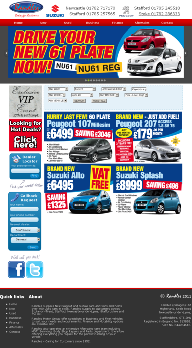
Enhanced: Randles Website Layout
A couple of days ago we launched the new look Randles website. To the untrained eye the site may not look that different. The main purpose for introducing changes gradually is to avoid alienating regular visitors.
Here’s what we did:
- Change “Use Stock List” to “Used Vehicles”
- Box in the “Used Search Form” on the “used” page
- Insert the “User Search Form” onto the home page under the banner
- Update the “parts-and-accessories” page to include randles-stafford and randles-stoke (Peugeot) links
- Fix the overlay links (changed to iframes)
- Accommodate larger banners (920px*270px)
- Add a 190px*190px badge to the top of the sidebar, above the dealer finder, which says “Click here for ‘hot deals’”, similar style (in red).
- A new (larger) footer. The footer will be split into 3 sections: Quick links, About and Copyright/legal. The “Quick links” will come from the existing links. The “About” will be taken from the bottom of the homepage. The copyright/legal will stay the same/be made clearer.
Here’s what that looks like:
Admittedly there’s still some tweaks to do, but it’s work in progress and always moving forward…

Comments