Update: Randles Website Homepage
I’ve been quiet for a little while settling into the new job role and tackling some quick fixes as well as dealing with some larger infrastructure challenges.
I originally created the current Randles website as a stop gap to tide them over until a plan could be put together for a better one. Now I’m here full time, that plan is in place and I’m able to begin rolling out some much needed changes to bring it up to speed.
This is the homepage as it stood back in June.
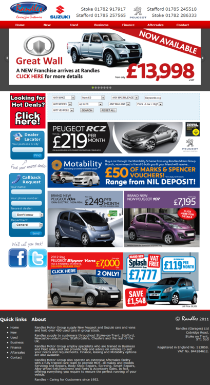
Dated, busy, clunky, it needed some work.
Last month I quietly pushed out “Phase 1” of the changes I’d made to the Randles website…
- We know the “used” is the most popular section, so as per the “F-Layout” the “used search” was moved to fit into the banner section
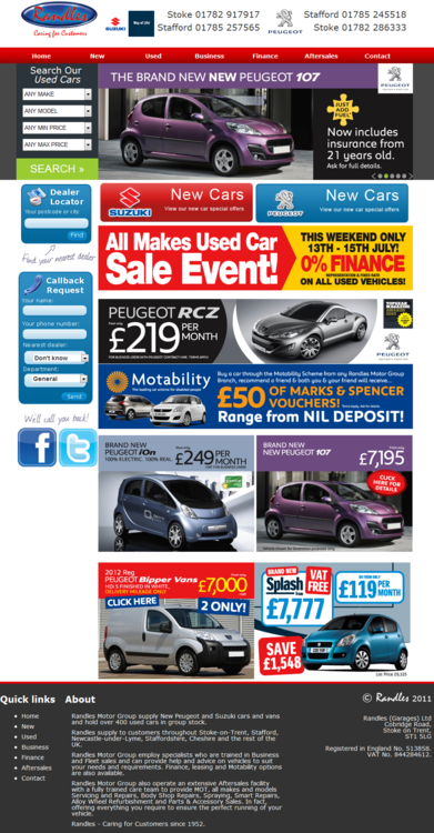
- It needed to be more obvious which manufacturers are at Randles, so by presenting navigation blocks on the homepage and pointing them to the new vehicle landing pages the user experience was improved

- The style of the sidebar needed modernising to fit in with the look and feel we were heading towards
This resulted in it looking like this:
That’s Phase 1 complete. Much more inviting and a much better user experience I’m sure you’ll agree.
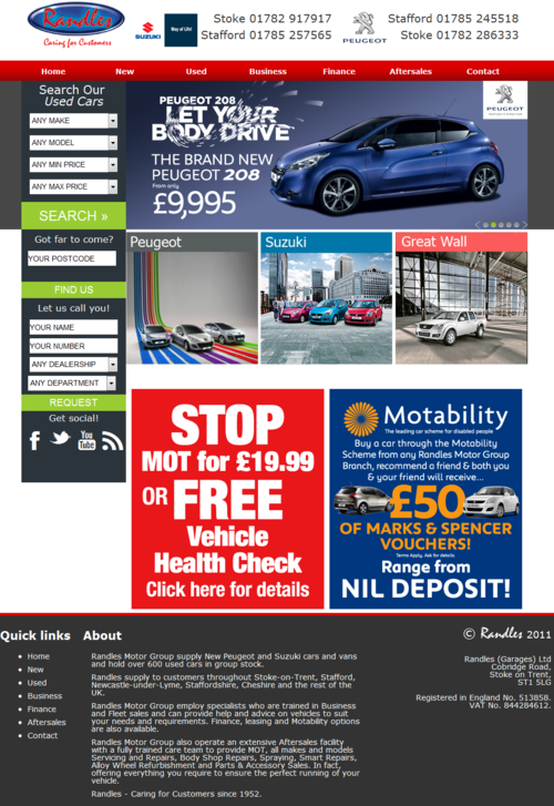
We’re not quite there just yet though but we’re almost ready to roll out “Phase 2” so watch this space.
Comments