Enhanced: Randles Navigation
After discussing website improvements with the Randles Motor Group marketing manager we decided that the website needed a new navigation menu with simple requirements:
- Accommodate additional pages
- Improve search engine visibility
- Improve user experience
- Less white-space
Originally the navigation was a flat horizontal menu at the very top of the page, which had a “hint” saying “Browse our website” with an arrow to make it obvious to novice users that this is how you navigate the website.
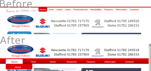
To tackle the criteria I did the following:
- Adding sub-menus to accommodate the new pages and improve visibility.
- A menu bar was created across the width of the page which separates the header from the footer filling any undesirable white-space.
- The more familiar look and feel of the menu bar with the drop down menus gives the end user a better experience as it is more familiar to them.
I’m sure you’ll agree that the new menu is an improvement on the old, and if not, let me know!
Comments