Concept: Randles Website 2012
The current Randles website is due an overhaul.
The brief is create a new website for the Randles Motor Group to accommodate the new franchises while giving us the opportunity to introduce new technologies and take advantage of modern concepts.
Here’s a sneak peak at the initial concept…
This new concept design takes Randles in a completely new direction.
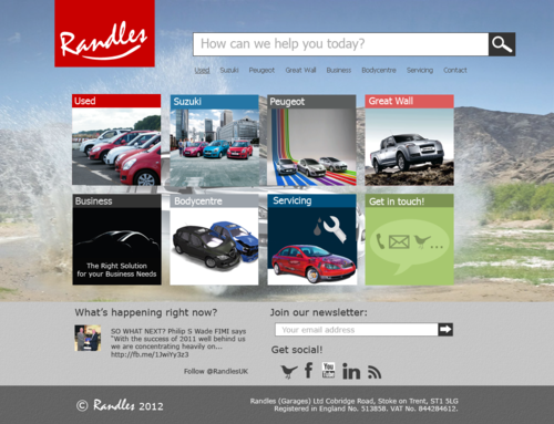
Features
- Blocks: Similar to the upcoming Windows 8 interactive tiles, this creates an intuitive website navigation with the most popular options displayed first.
- Logo: It’s human nature to look for a face, so the new logo sports a little smile. Combined with a bright red square in the background and a white typeface the Randles logo is now unmistakeable.
- Search: From a user experience perspective, this makes it very easy to get help and find content on the website that may not be obvious from the navigation. From a management point of view it means the content can be tailored to the search queries.
- Live updates: To keep the website fresh, a social network feed will sit just above the footer, allowing the website to act as a social media hub.
- Join the newsletter: The newsletter is a great way to keep customers informed about Randles, so giving new customers the opportunity to join is important.
- Social links: Twitter, Facebook, YouTube, LinkedIn, RSS (Blog): Randles is on them all, and now you know.
- Background: Subtle, but exciting. The idea is to periodically introduce new backgrounds to suit the section of the site, a new car or a current promotion.
- Mobile first: The new design will utilise new technologies and concepts to create a responsive design that will not only look great on a mobile phone, but on tablets, desktops and even large TVs!
So what do you think? Your feedback is welcome.
Footnote: Thanks to mediaqueri.es and @scottohara for inspiration.
Comments